This project is about responding to the poem by T.S Eliot which was part written in the seaside town Margate, which is my neighbouring town. I asked a peer of mine who is studying at Brighton University to collaborate with me on this project. We both have similar interests in capturing sense of place and photography of buildings. I wanted to test the experience of collaborating with someone from a distance.
Through out this project i have pushed myself to learn new things to help me develop in this project.
Workshop classes: Laser Cut, Dark room, Riso print, Premier Pro and Projection Mapping.
All these new skills have helped me progress as an artist and i shall use them in my further research over the next coming year.
ARTIST- Ann Veronica Janssens
https://wellcomecollection.org/exhibitions/states-mind-ann-veronica-janssens
This video gives a quick view of her piece 'yellowbluepink'. She creates a new space by using water vapour as a material to capture projecting light which creates a disorientating and intriguing experience with in a plain contained space. This is similar to my idea of creating a contained space to get lost in (the void).
ARTIST- Jespur Just
http://www.arttube.nl/en/videos/jesper-just
This artist works with film and uses architecture for his films to be projected onto, creating these new spaces that dint exist before. This is similar to the idea of this plain empty cube which becomes alive when projected onto and a new world when entered into.
ARTIST - Anthony McCall
https://hepworthwakefield.org/whats-on/anthony-mccall-solid-light-works/
His works 'Solid Light' uses light projections to create these new structural spaces. I'm intrigued on how light plays apart in creating and enhancing spaces. Like my work the void i use light to make a space come alive.
ARTIST - Neville Gabie
https://www.nevillegabie.com/about-neville-gabie/
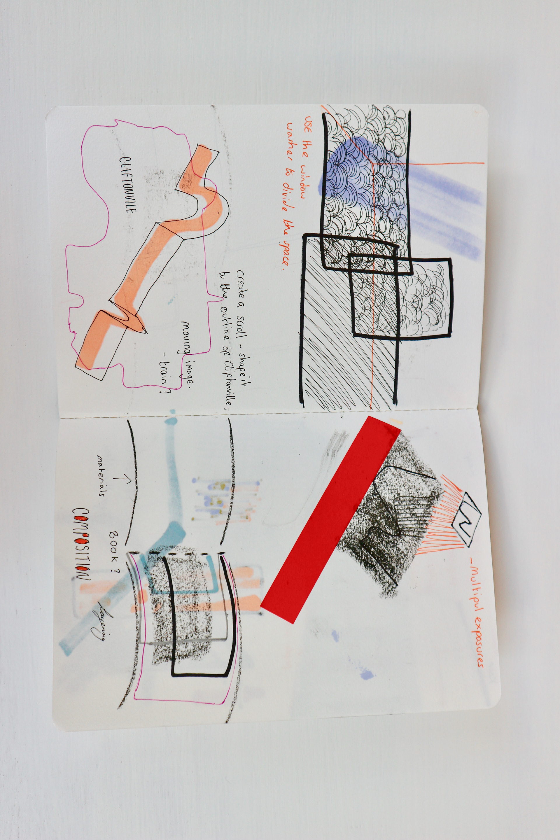
His work is sculptural pieces which directly respond to the place and they help to elaborate the constant change in flux a place is. My work is about capturing Cliftonville in its current state ...
Research -
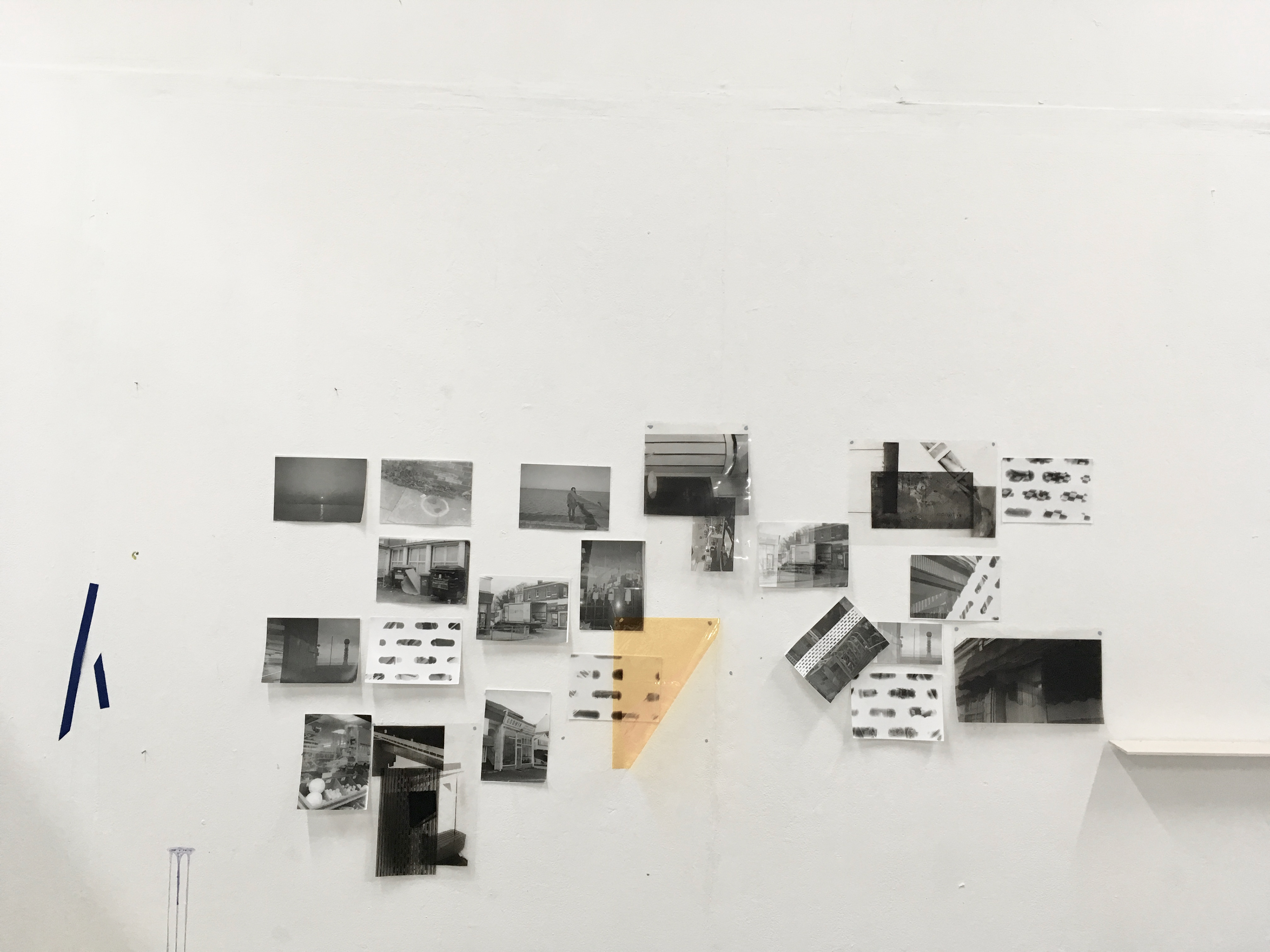
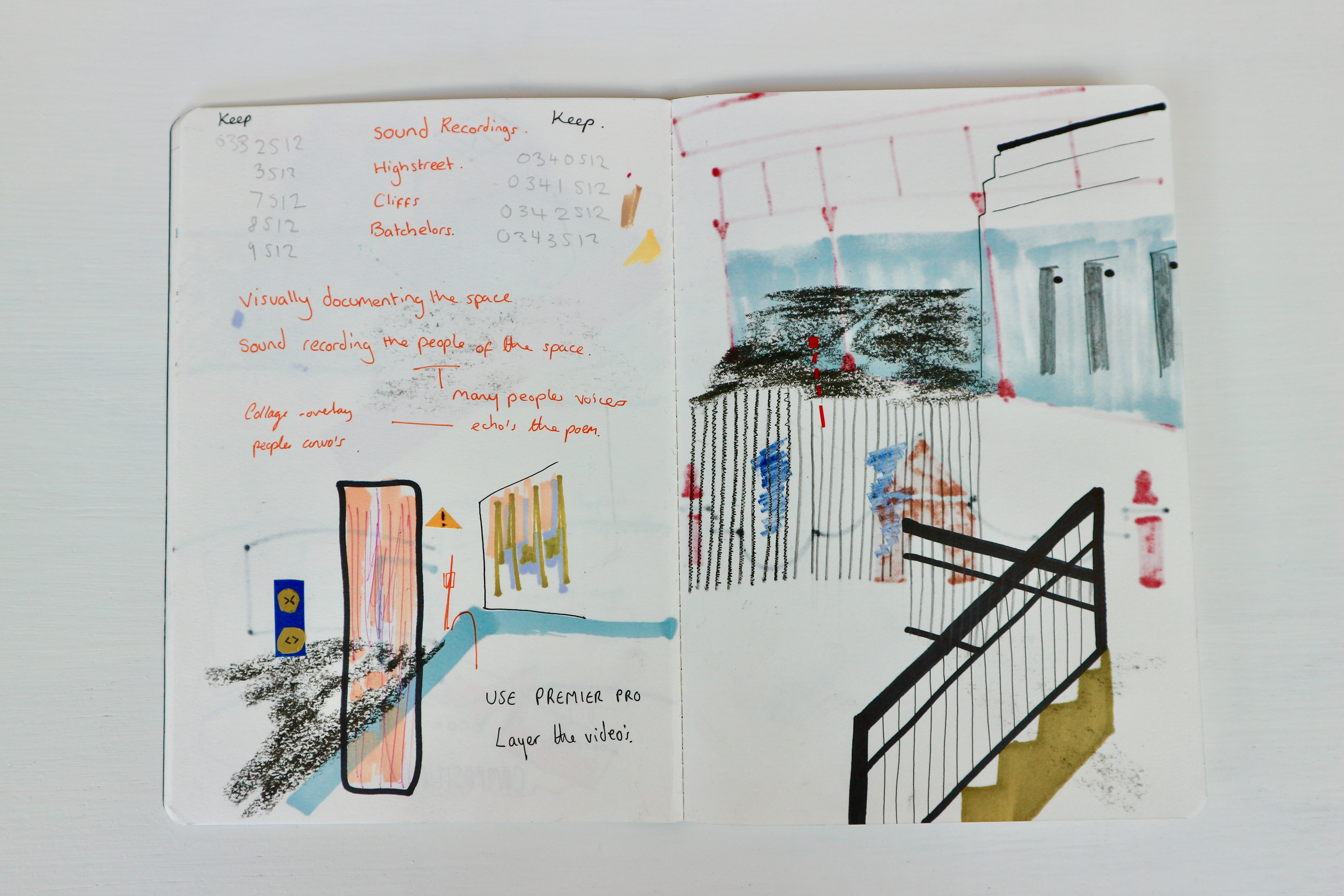
We visited Cliftonville on many occasions recording the town - textures, surfaces, cafes. From researching i started to gather an interest in capturing alternative ways of seeing and capturing the mundane - recordings of light reflected - momentary findings.
On my pen stick there will be files showing everything we recorded.
These images and recordings are glimpses into my new discovery of recording the mundane.

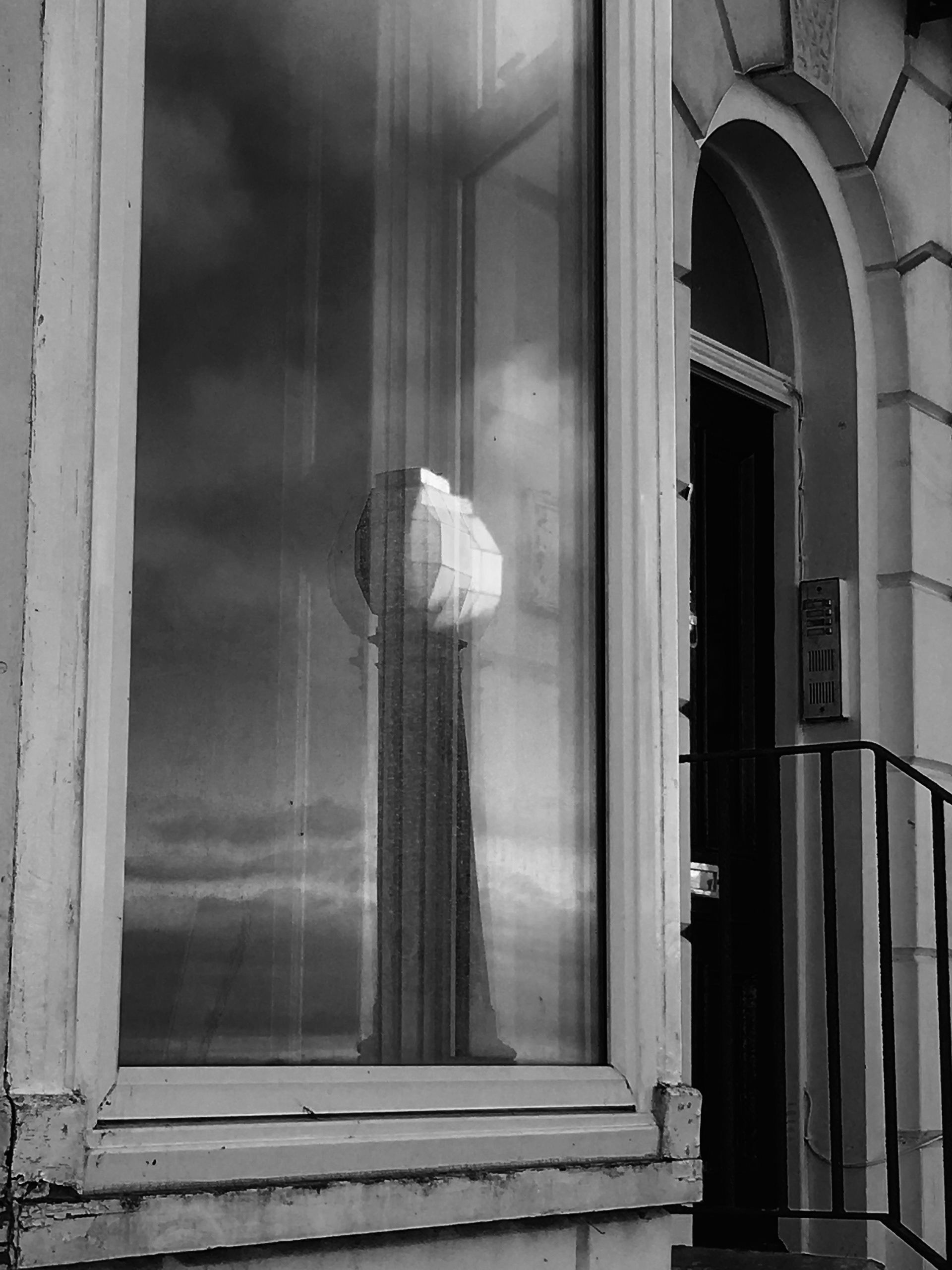
My interest into capturing reflections and fleeting moments.


On my visit in Copenhagen I came across this piece by Wolfgang Tillman - This work looks at the banal and is about a time specific image.
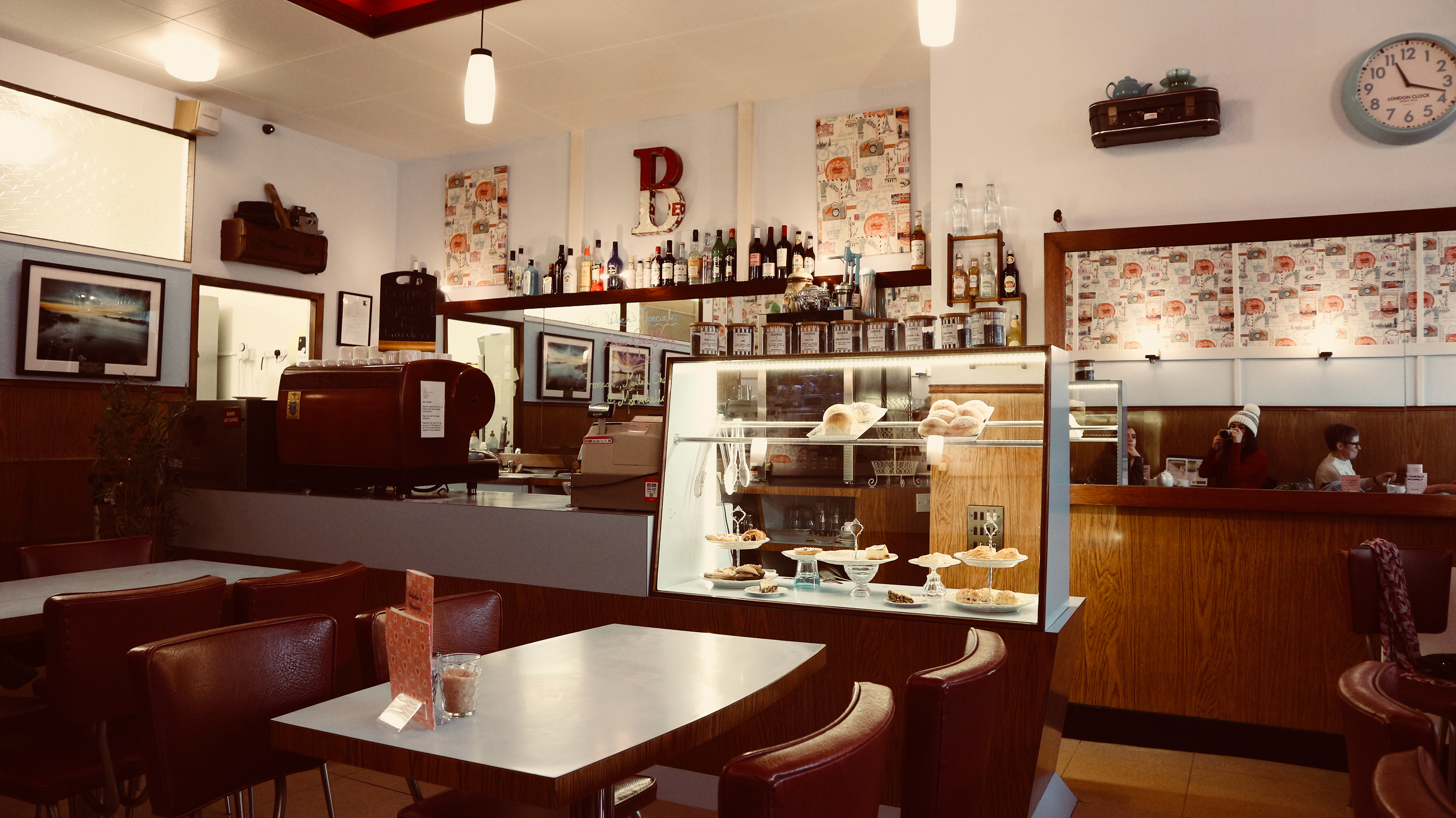
The Cafes
As our work not focusing on photographing people as we want the audience to be able to immerse themselves into the work, we went to the cafes to record the sounds of people chatting and talking. Thinking about JUXTAPOSITION - peoples imagery with sounds of people.
The decor of these places were trapped in time still and the people that entered were either old or working men.
The first 2 images are in the Batchelor's Patisserie (mainly older generation) and the last 2 are the Dalby Cafe (greasy spoon- working men).


Creating work to explain and explore the environment.
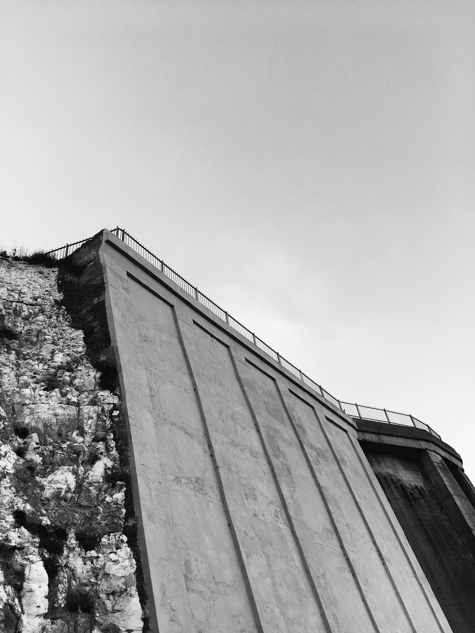
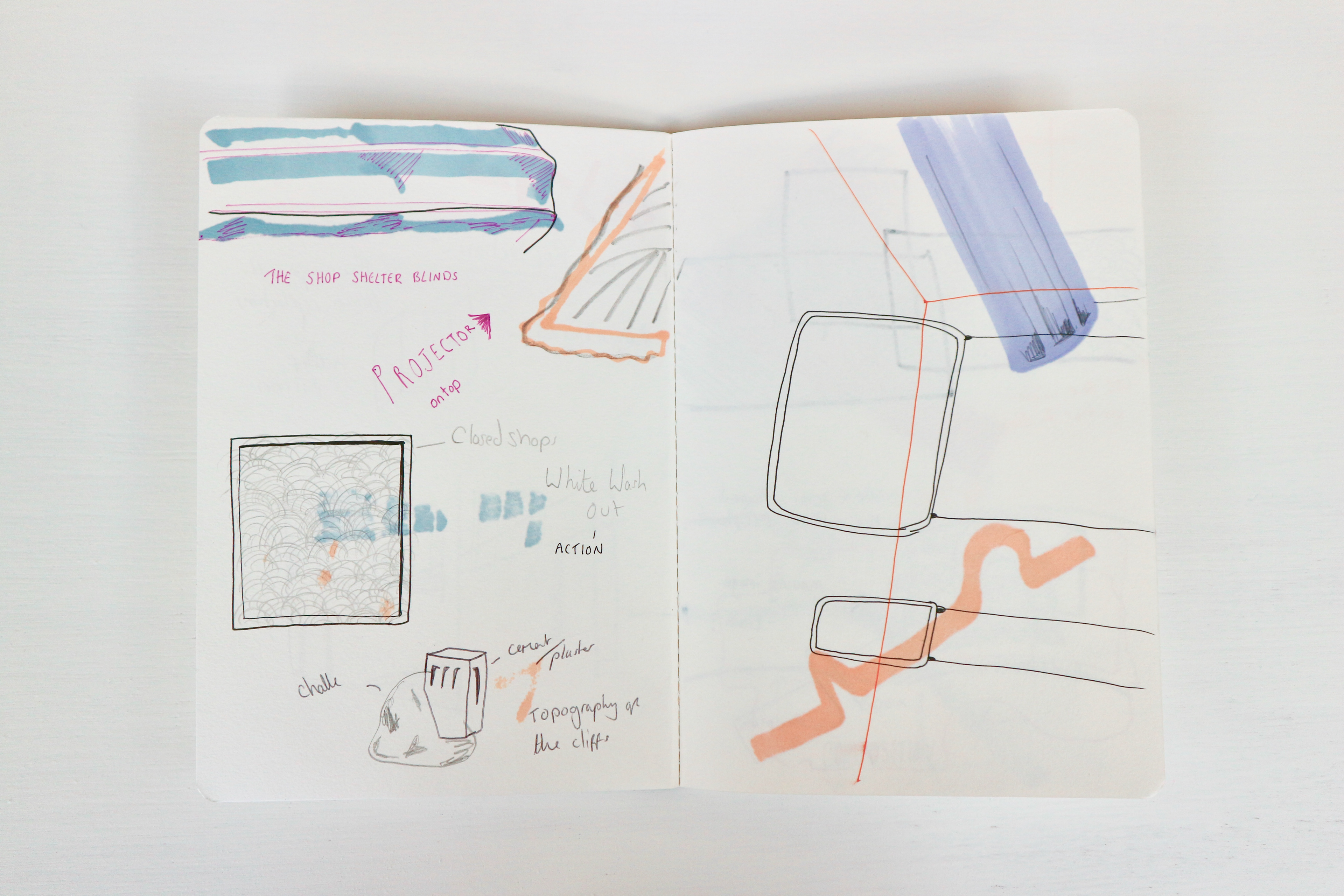
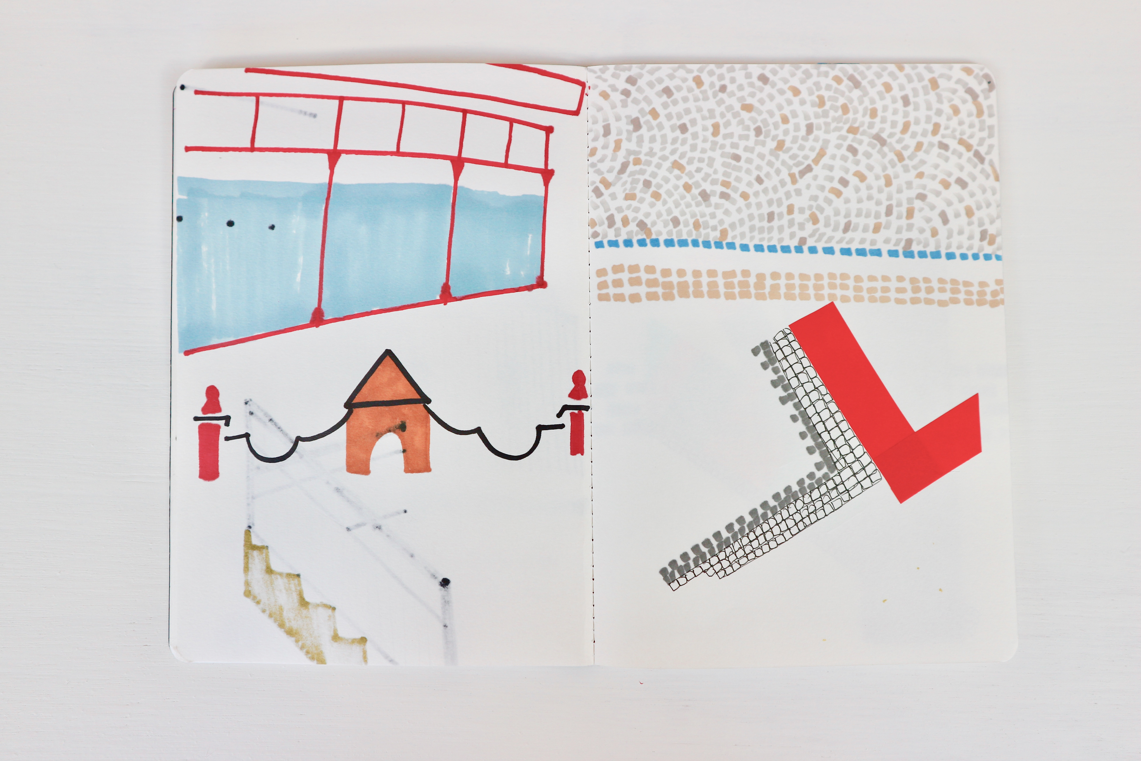
When exploring the seafront, I noticed how much concrete comes into the space- the walkway, the pools, the cliff walls . Wanted to explore this so me and Ella chose a piece of chalk for us to experiment with plaster. Did debate whether to add colour to the plaster, but realised wanted it to look part if the chalk so left it colourless.
I recorded the plater dripping and pouring onto the chalk, it was hard to find the right consistency, it was starting to set as soon as it hit the surface.


There is a video on vimeo - the link is on my page called video's. The video shows the plaster pouring onto the chalk.
These photos are pieces of plaster gathered from the seafront for referee.


The Violet Hour - Exhibition at Margate
All over Margate different galleries and spaces are hosting exhibitions with works that have been inspired by the poem. This exhibition was Nayland Rock hotel in by Margate beach. I liked how it was set in a hotel and so every room occupied a different work, just like a hotel these rooms would occupy different sets of characters. A piece that stood out to me was Lumen prints by Amanda Marchand. These prints where studies on light that casts formed through the sun shining in through the windows.
I'm intrigued on how she has kept or achieved the blue and pink tones. I did message her on instagram, but never replied back.


Playing with negatives
Using a torch light, played with the image projected from the negatives. This is linking in to my interest of wanting the audience to play with the art work.


Dark room - Developing images
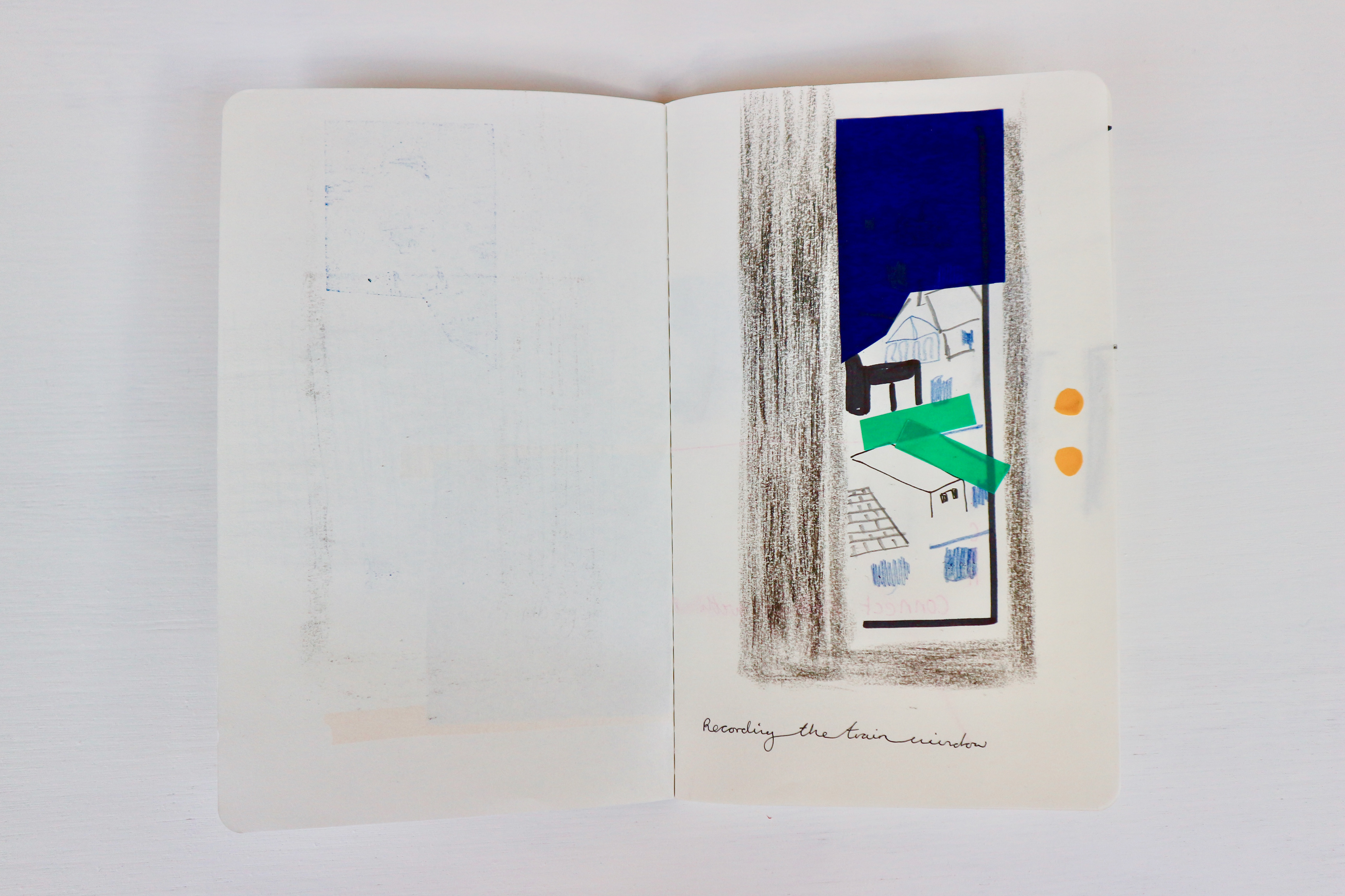
I learnt how to use the dark room and developed my images from Cliftonville. With the exposures i experimented with shapes - I created a cut out sheet of paper that represented the shutter i found in the windows of the shops. These acted like frames for my images of Cliftonville - looked like you was looking through the shutter to see a space with in.


Discovering lumen printing
With off cuts from black and white photographic paper I accidentally took them with me outside, and then saw the paper starting to change colour. After discovering this I then overplayed my photocopied acetates to create an image on them. I left only some of them over night and some for a bit longer - weekend. After fixing the image i noticed the slight colour change (blues had gone) but i was still happy with the pinky tones. After this I then set about doing experiments around the uni, finding what light is best.


These are the experiments after they had been fixed.
The left one was exposed in the most light where the sun shone on it during the afternoon.
The middle one was exposed to less light, hidden under my table in the studio. Not much detail was gathered.
The right one was exposed in the dark room. Limited light and mainly red light. Pinker tones were captured, and the pink tones came from where the negative had the most black.
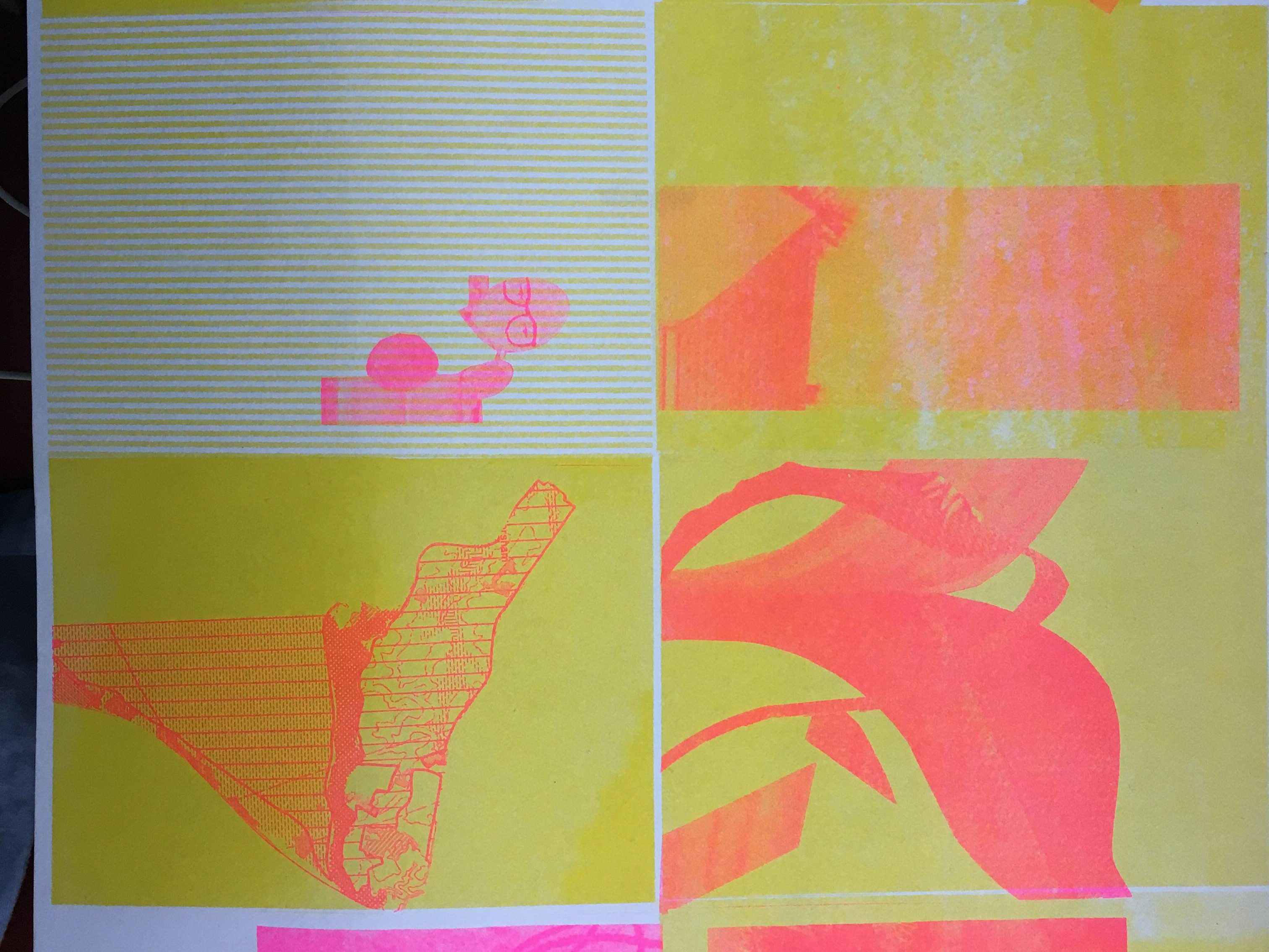
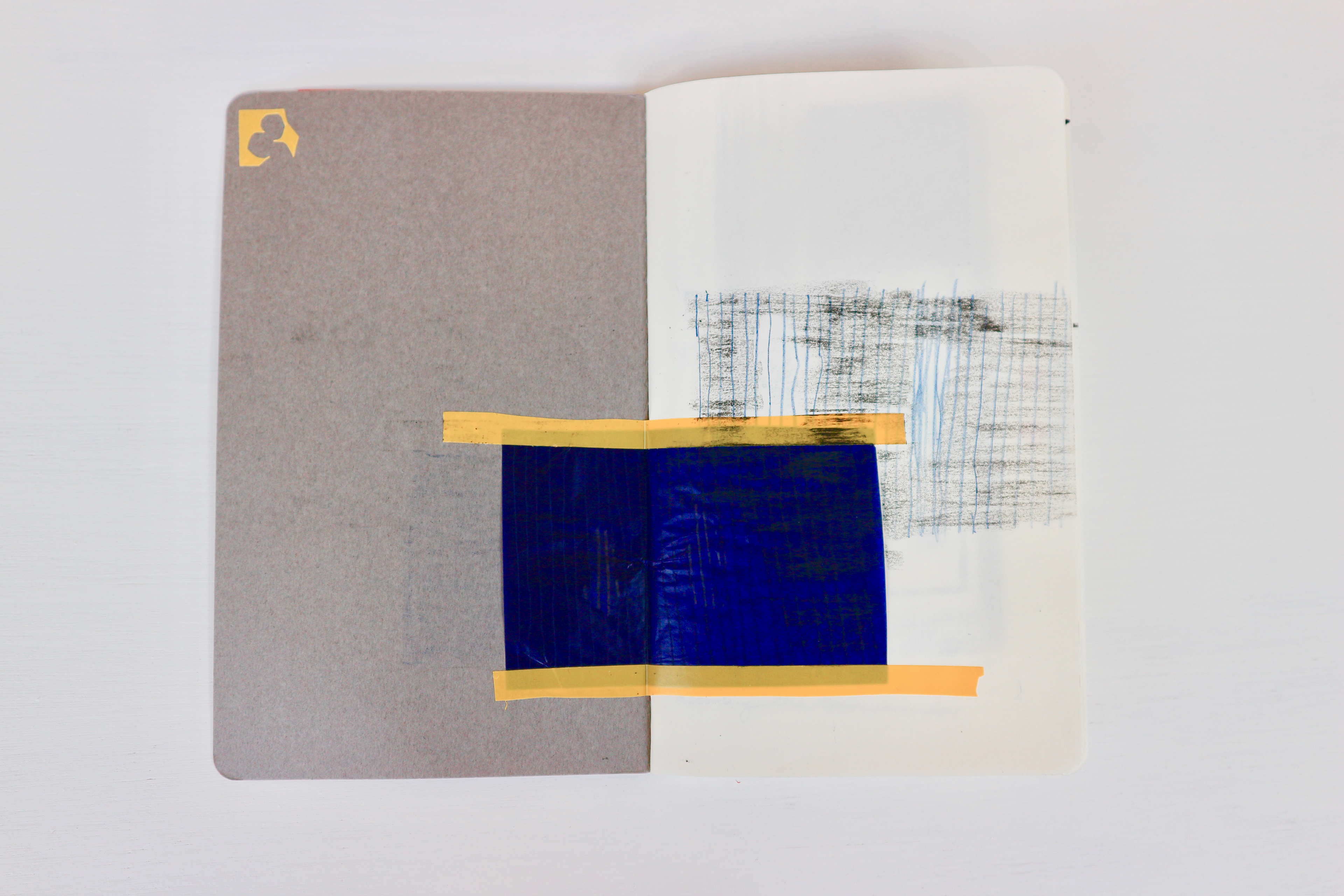
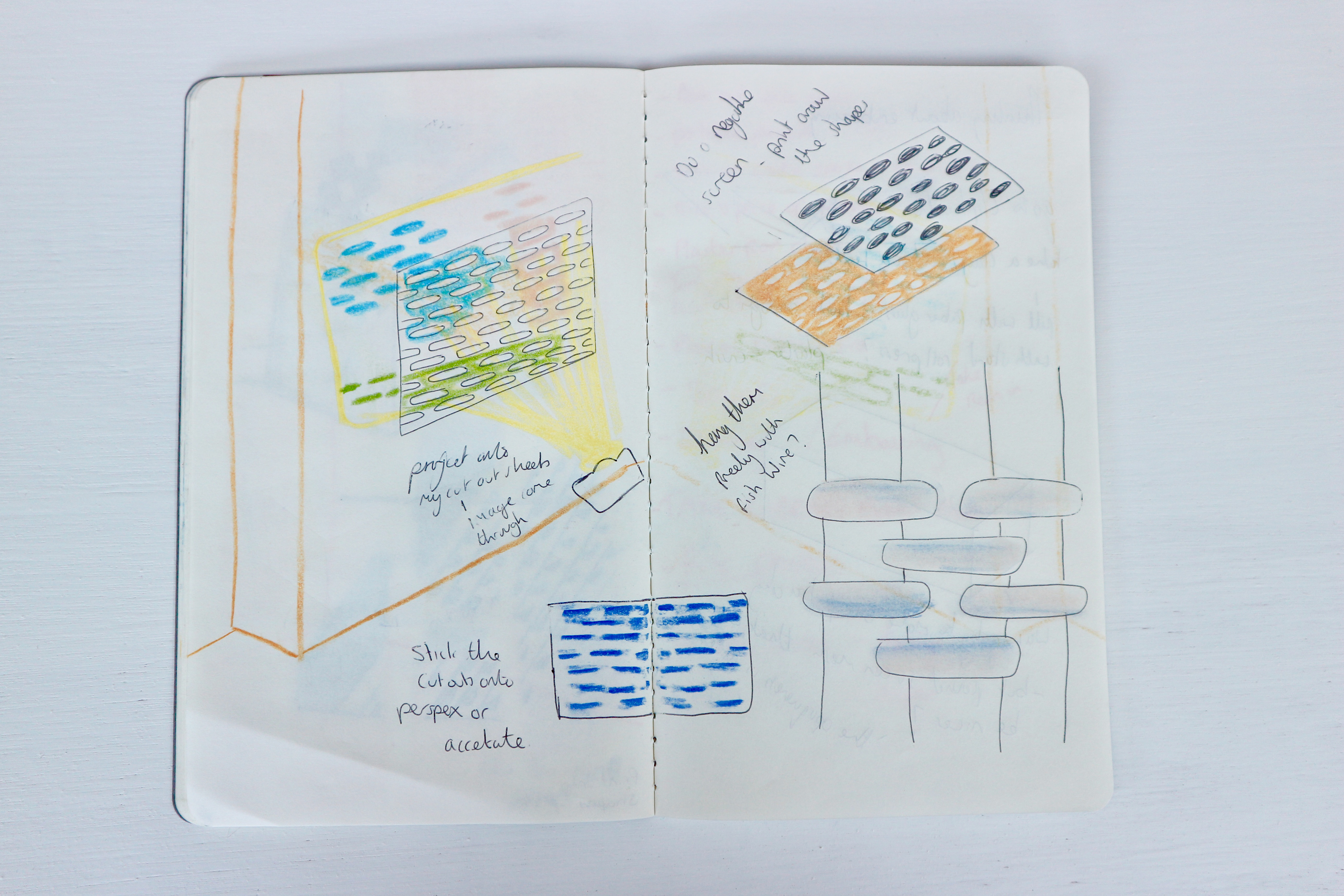
Through out I have played with collaging my images with photocopying onto acetate. I then decided to play with silk screen printing. I wanted to use the colours i have found in lumen printing to aid my choice in ink. My first batch of colours are too bright and so i decided to dull them down and only created more colours from the existing colours so they all matched.


I then took the idea i had from dark room experiments and created a cut out sheet for which would act as frames for the images to print through.


Instead of using the positive I decided to experiment and print on the negatives and soon realised I preferred them and can play with different layouts by re arranging them.


Even on the screen I played with blending the colours, being free with my experiments.


I enjoyed creating these mono screen prints, playing with different collages. I like the colours i came up with in the ned, but as an image i wasn't overall satisfied, felt a bit flat as all just images. Think it need some real texture plays and line drawings with it too.


Thinking about creating a book to show case our research, got me thinking about paper. As we did try and gather textures using soft ground etching but the wax would dry out before we had gathered any information. So it let me to paper embossing by gathering textures with clay and then making a resin cast to press into paper.
Thinking of what textures to gather - did want to gather the mosaic patterns that was around, but was finding it hard to gather the information. Went for something deeper, so went for the floor drains i could see on walks around Cliftonville.
After creating the resin cast's it took them to ask Peter (print technician) and he said they were too thick to fit into the roller press. So the only way to get them to work would to make my own paper and press it into the mould. I had a go at this, found out that if you mix canvas with paper, get a flexible soft paper. But the end result i didn't like the look.


The resin has a yellow/ brown colour to it. I saw some of my fellow students using clear resin and they said they ordered it from online, costing them around 20 pounds. This has got me thinking about the artist - Rachael Whiteread.
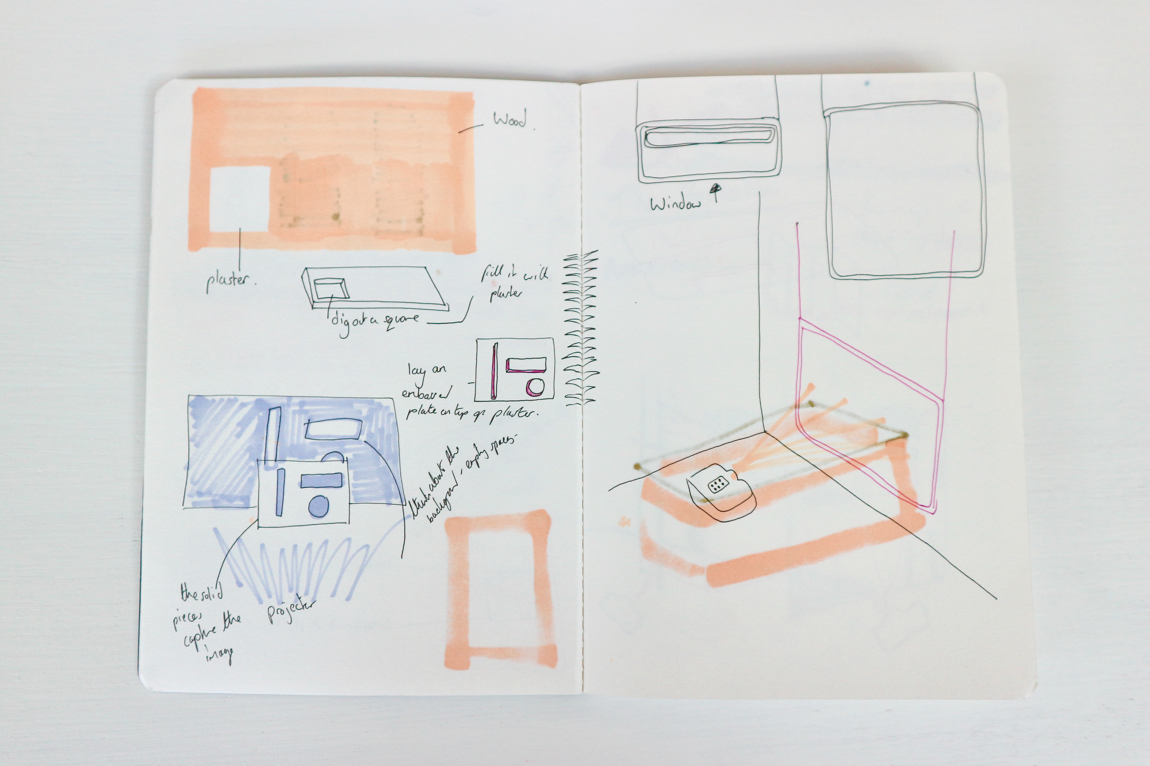


I did acquire some empty window frames for my idea of using them as planes to project onto; as the idea of looking at and through windows was a theme in my work.


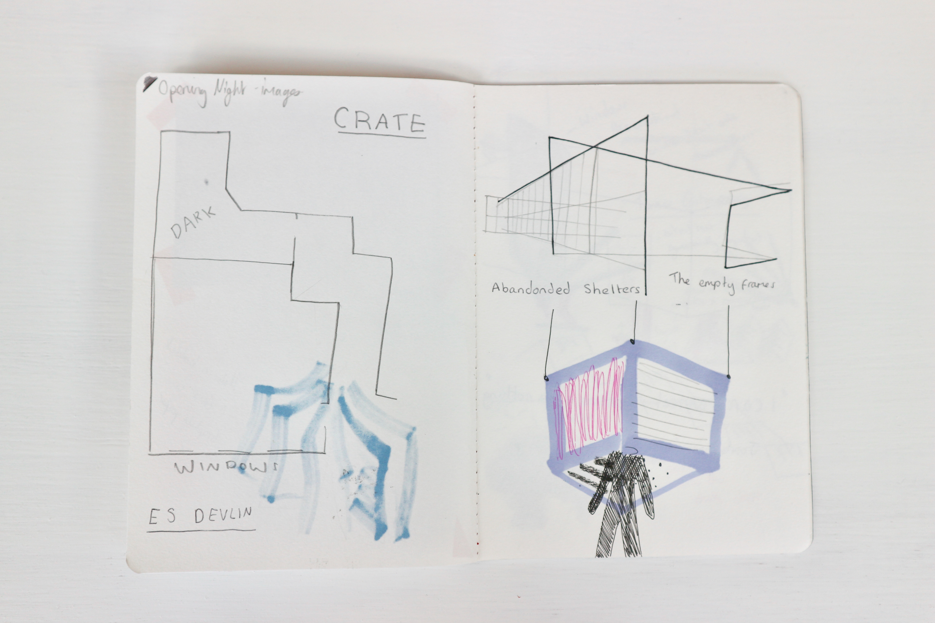
With all my research and findings, I have a sketch book with ideas on wanting to create a piece that can be exhibited in 'Different Voices exhibition' at the crate. Throughout I have thought about creating a space that is easy to transport but at the same is a space big enough and work for the audience loose themselves in. They needed to be able to enter in and out of this space easily and with it all being visual it only needed to be head hight.
I Kept coming up with and idea of a suspended cube which hung from the ceiling and now people could enter by walking under and entering into this new space.
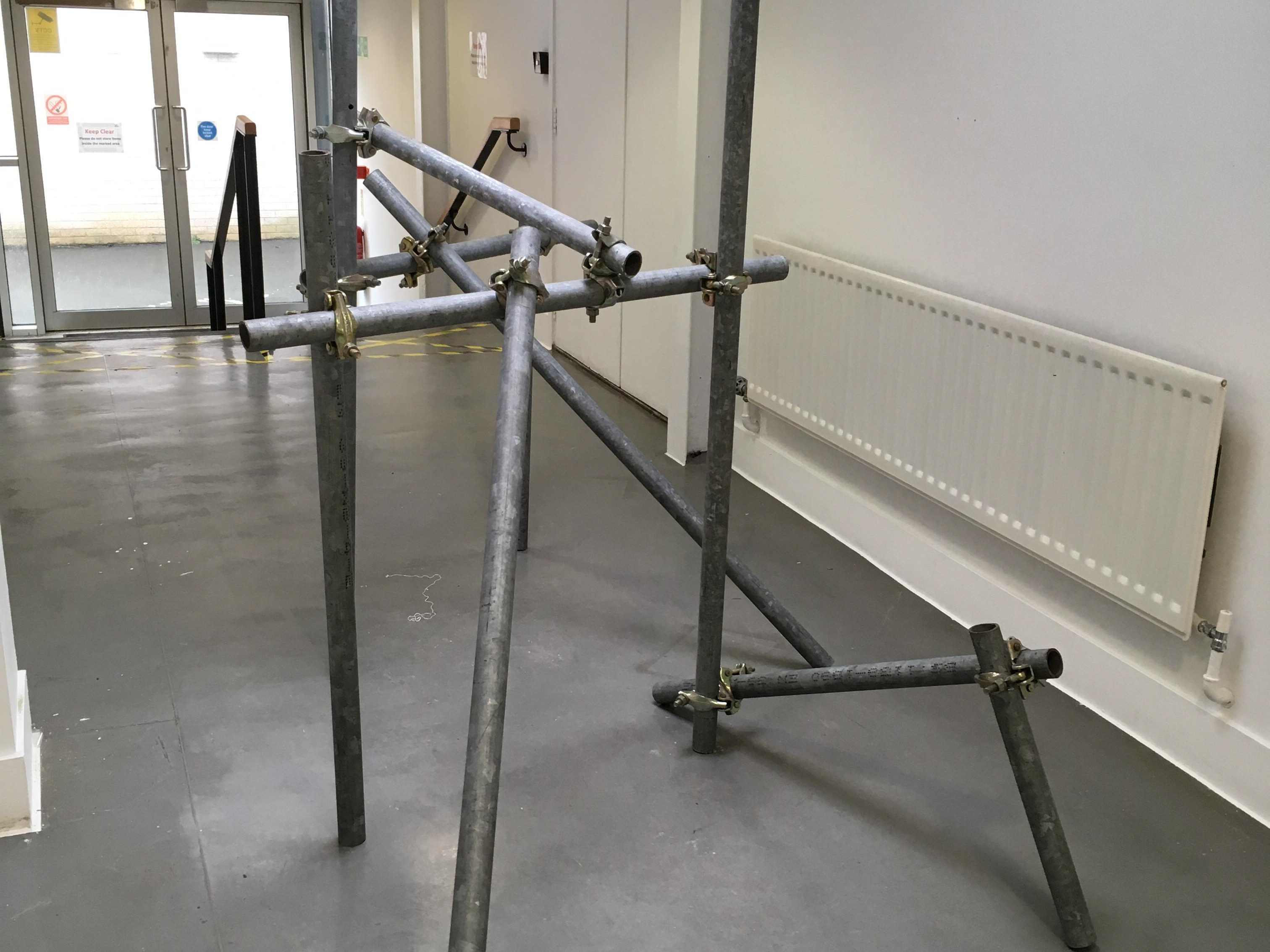
I went to martin as i wanted to create a basic frame, so was similar to creating a canvas frame. I gave him a rough outline of how big I wanted the cube to be and so we came up with that i need to buy 4 lengths of 2 by 1 ply.


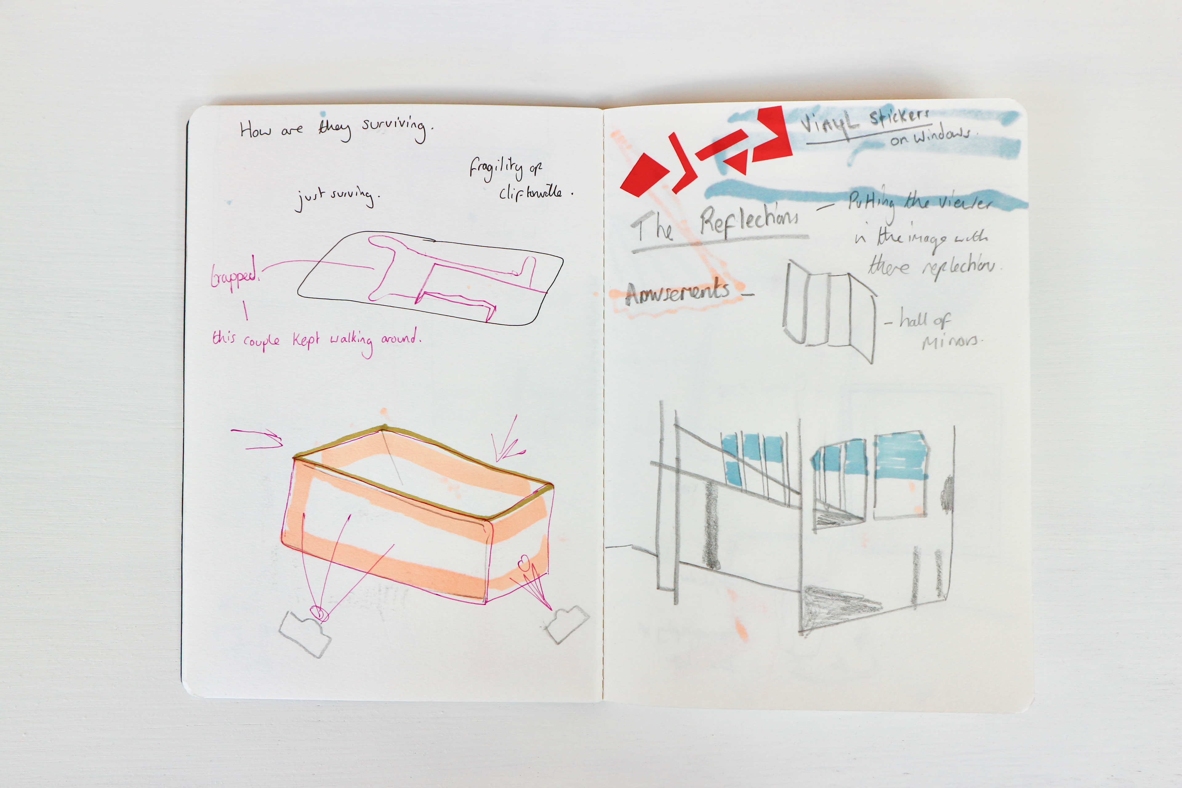
Thinking of materials, was going to use a scroll of tracing paper that I could wrap round the cube. And so the height would of been 84 cm tall. But from being in the canvas room I found the silk screen polyester material, I preferred the qualities of the material more as it was less rigid. So I was able to increase the height to 100 cm.

After finding out the material is what Peter uses for his print screens i asked him is he had any material he wasn't using and so I gained a roll of print screen material to wrap around my cube. The qualities were exactly what i need, semi transparent (frosted glow).


Ella came back down from brighton and so we decided to bring the cube to life and fix the material to the cube.
In the section - Videos - there is a link to my vimeo site which has a time lapse of me and Ella making the cube.


We then took the cube into the Herbert Read gallery to experiment with projecting.


Then started to figure out how to hang the cube. We added eyelet screws so we could add string to them for it hang.
I measured out the middle points of it each side to i could then find the centre. From here I tied the wire to the central loop so they were all equal. But it was scientific enough, they wasn't the same size. Need to come up with a more secure idea.


The new design featured 4 measure lengths that was already attached to a central loop. They had hooks attached to the end to clip onto the Void. Then with the central loop, it can then be attached to another wire to the ceiling.

It floats.


People were intrigued by what they saw, they had to record what was happening around them.
This is exactly the reaction I wanted from the audience, engaging and being intrigued by what they saw and wanting to record it.
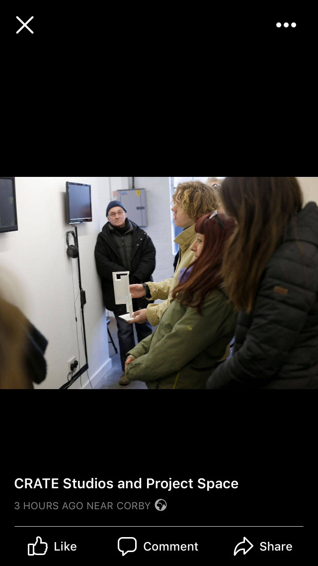
Talks at the Crate space with the artists from our group 'Different Voices'. It was nice to get a detailed inside into the other artists work and form this visit i started to think about how me and Ella could occupy the space.

Visit to Turner Contemporary
A range of different artists have responded to the poem in various outcomes. There was a few responses that matched my eye.
Jo Stockham - Never Home - hand coloured digital print on banner paper. Love the unfocused quality to the image, really intriguing with the red coming through the cracks.
There was a lot of artists playing with moving image and sound. One that really grabbed my attention was Sump, 2016 by Benedict Drew and Nicholas Brooks. There work was a video installation which played with confusing imagery and disorientating sound.


The book - Nothing With Nothing
Currently in show at the Turner Contemporary.
I have managed to sell one and another one has gone with Rob Macdonald to go to the Book fair in Barcelona.
Realising the limited space in the crate and the only dark room already occupied with another students work, me and Ella realised that the void could not be exhibited there. We then came up with an alternative solution for our to be show cased by creating a video of our installations which could then be played on the TV monitors within the space. Unfortunately the bad weather lent to the exhibition not being open for the final weekend show and so we didn't get to show out void.
There was another chance for our work to be shown within a space, The Turner Contemporary. Ian Bottle was creating book cases for work to be displayed on. This is when I got creating my book 'Nothing With Nothing'.
Leading from the same feel of the void, playing with collaging and overlaying and getting the audience engaged I wanted to create a book with a similar feel. I was going to create this effect by having varying papers to play with translucency, so as the audience turn the pages new compositions were created.


I created the book to have no type as I wanted the images to take focus and the compositions created. The images are from the research visits, they are mainly mine but it also features some of Ella's photo's too. I pre planed what layouts would be printed on to what paper but didn't know what the layout of the whole book would be until I created the book, letting the images and overlays take control.
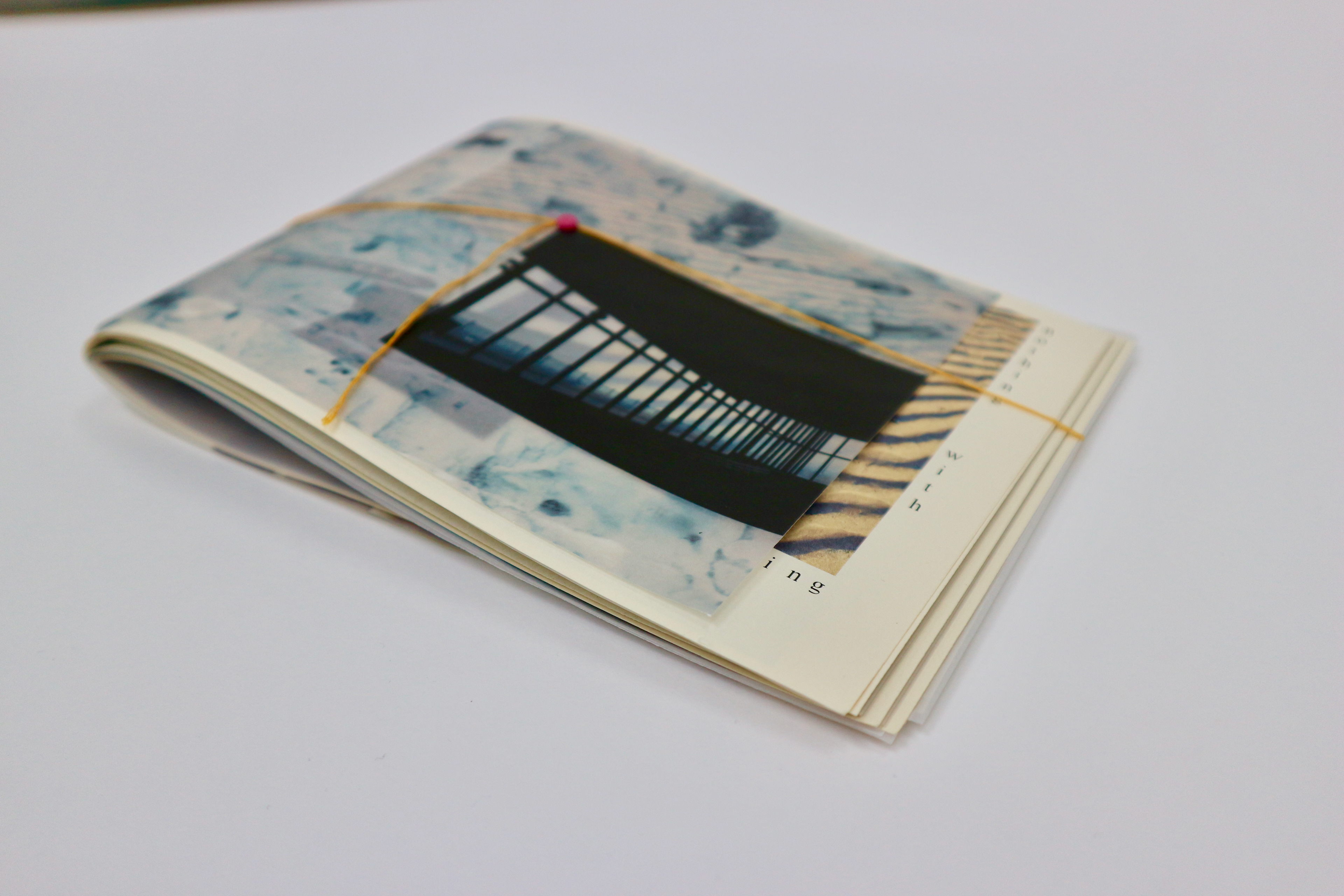


With the binding I went for an unconventional bind and only had 4 holes which meant there would be 2 stitches on view. I chose the colour yellow to reference it being mentioned in the poem "Yellow dust", it also references to it being a coastal setting with the yellow against the blue.
I have incorporated the binding into the book by using it as a fastener, which also adds to the composition to the front cover.
The title is incorporated into the composition of the book and is placed to be able to read in any direction.
Thinking about the amount of work we have achieved me and Ella started to look into gallery spaces with in Margate and Cliftonville.
We enquired -
Viking Gallery, Cliftonville - £60.00 a day - can hang from ceiling - massive space (too big ? )
Resort Studios Cliftonville - amount wasn't given - did have resources for us to hang from ceiling.
Crate Space Margate - £ 70.00 for a week for both spaces - can hang from ceiling
After having positive responses from all we then decided we wanted to go with crate due to there being a dark space available for our void.
I started to sketch out ideas of how the work could fit.
We haven't agreed on a date yet with the gallery.

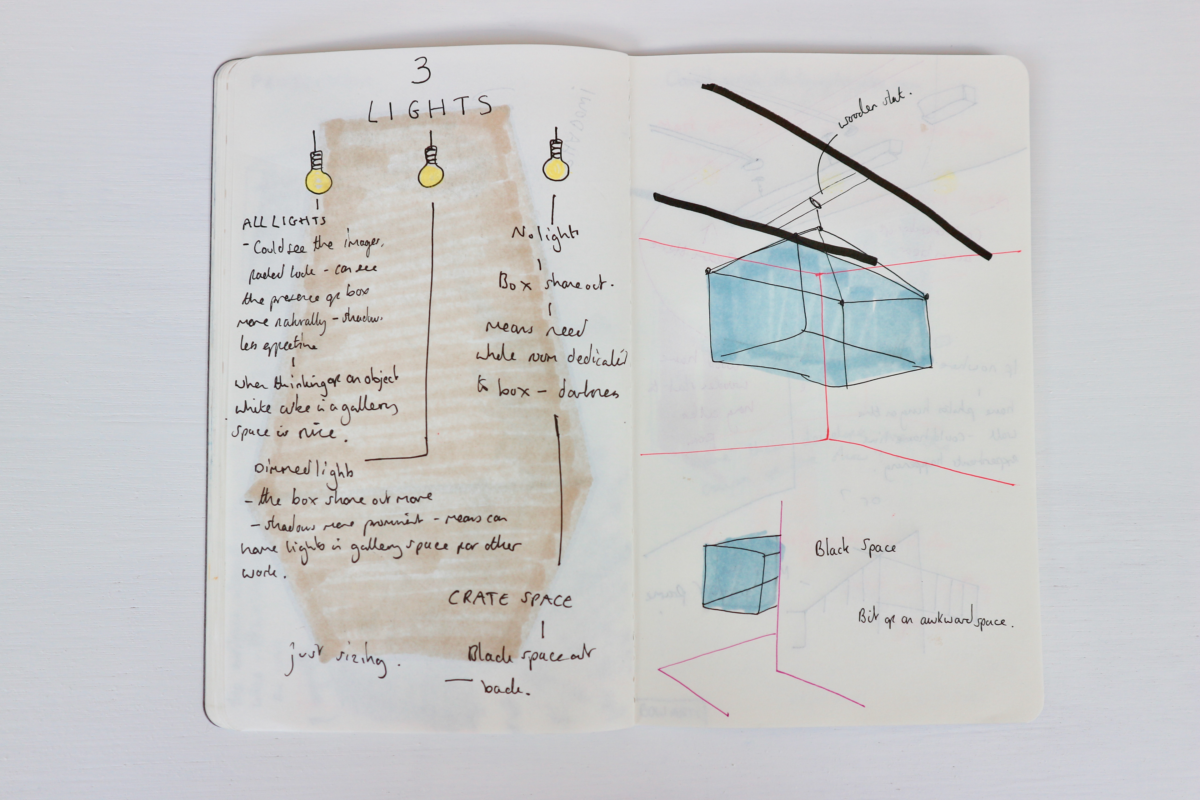
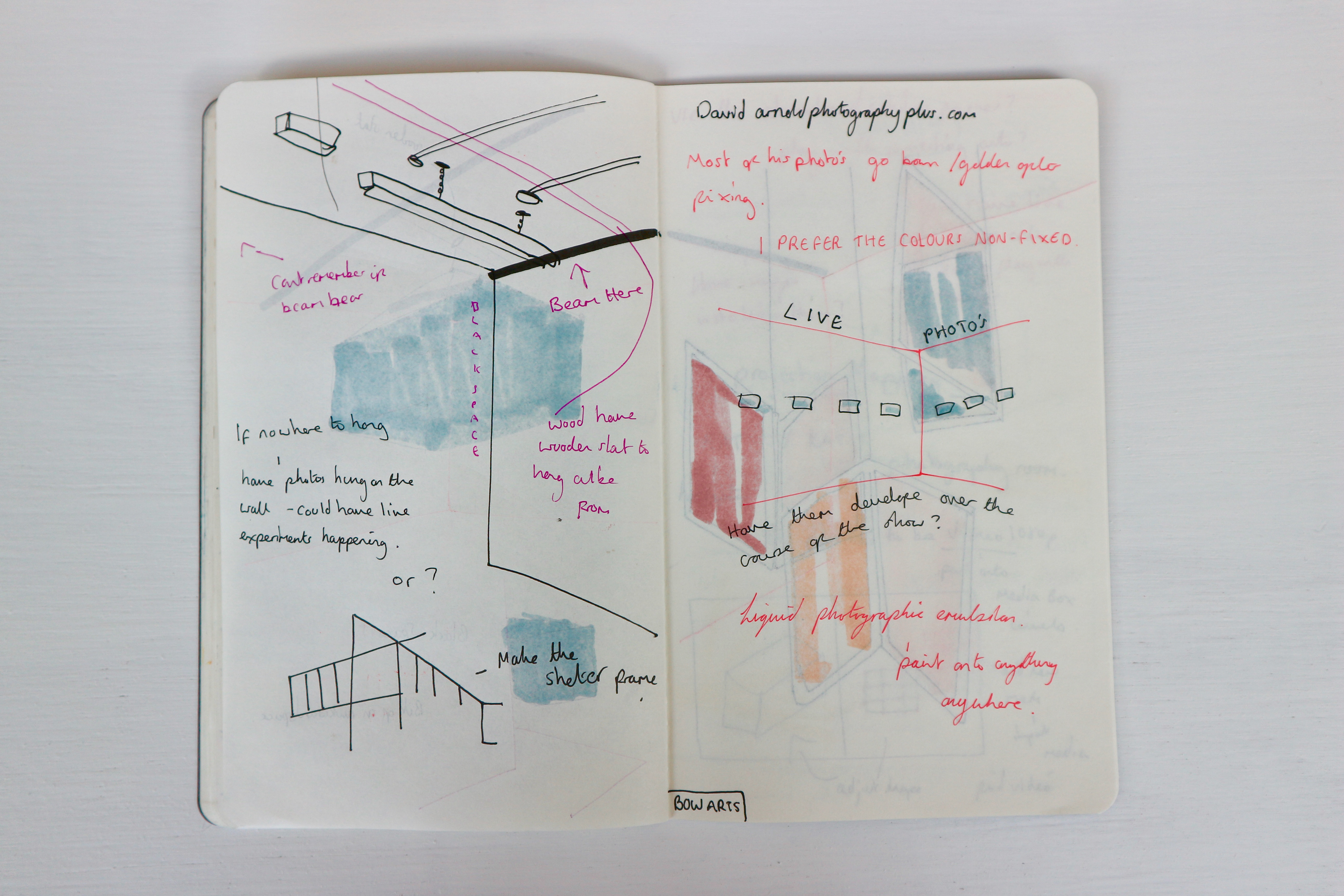
Thinking about the spaces of the crate studios - White space and Dark space.
Naturally we decided that the void would go in the black space for portion, but then we started to think about how much we like it as a piece and how it did look good hanging up in the Herbert Read gallery (white walls).
I booked out the white space at uni and tested how the projections looked in various lights.
Blinds open - all light
Blinds part shut
Blinds closed - represent the dark space


Then led onto the play of projecting videos of the box onto the box.